Are you curious about how two things relate to each other? Whether it’s your sales and advertising budget or hours studied and test scores, understanding the connection can unlock powerful insights.
But how do you measure that link accurately? Knowing how to measure correlation helps you make smarter decisions and spot trends before anyone else does. You’ll discover simple steps and clear explanations to master correlation measurement—no complicated math, just practical tools you can use right away.
Keep reading to gain the confidence you need to analyze data like a pro and boost your results.
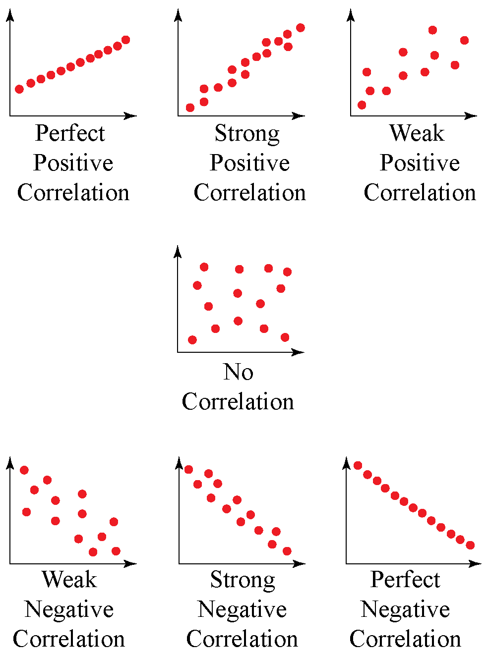
Credit: www.cuemath.com
Basics Of Correlation
Correlation shows how two things move together. It helps to understand if one thing changes when another changes. This is useful in many fields like science, business, and health.
Knowing the basics of correlation makes it easier to analyze data. It also helps to find patterns and relationships.
What Correlation Measures
Correlation measures the strength and direction of a relationship. It tells how closely two variables are connected. The value ranges from -1 to 1.
A value near 1 means a strong connection. Near -1 means a strong but opposite connection. A value near 0 means little or no connection.
Types Of Correlation
There are two main types: linear and nonlinear. Linear correlation means the relationship follows a straight line. Nonlinear means the relationship follows a curve.
Linear correlation is easier to measure and understand. Nonlinear correlation needs special methods for analysis.
Positive Vs Negative Correlation
Positive correlation means both variables increase together. For example, more study time leads to higher grades.
Negative correlation means one variable increases while the other decreases. For example, more exercise might reduce weight.
Understanding these helps to predict outcomes and make decisions based on data.
Choosing The Right Data
Choosing the right data is the first step to measuring correlation accurately. The quality of data affects the results directly. Data must fit the purpose and meet certain conditions. Poor data leads to wrong conclusions and wasted effort.
Data Requirements
Data should be numerical for most correlation methods. Both variables must be measured on the same scale or compatible scales. Data points need to be paired correctly. Each pair represents related observations. A minimum number of data points is necessary to find meaningful results. Usually, at least 30 pairs work well.
Handling Outliers
Outliers can distort correlation results. These are data points that differ greatly from others. They may appear due to errors or natural variation. Identify outliers by plotting data or using statistical tests. Decide whether to remove or adjust them carefully. Removing too many points can bias the analysis.
Preparing Data Sets
Clean data before analysis. Fill in missing values or remove incomplete pairs. Ensure data is consistent and formatted properly. Normalize or standardize data if scales differ widely. Check for duplicates and remove them. Well-prepared data gives clearer and more reliable correlation results.
Methods To Measure Correlation
Measuring correlation helps understand how two variables relate to each other. Different methods exist to find this relationship. Each method suits different types of data and research questions. Below are three common ways to measure correlation.
Pearson Correlation Coefficient
The Pearson correlation coefficient measures the strength and direction of a linear relationship. It works best with continuous data that follows a normal distribution. The value ranges from -1 to 1. A value close to 1 means a strong positive link. A value near -1 shows a strong negative link. Zero means no linear relationship. This method is simple and widely used in many fields.
Spearman Rank Correlation
Spearman rank correlation measures the relationship between ranked variables. It does not require normal data and works well with ordinal data or non-linear trends. This method converts data into ranks and compares these ranks. Values range from -1 to 1. Positive values show that as one variable increases, the other tends to increase. Negative values mean one variable goes up while the other goes down. It is useful when data has outliers or is not normally distributed.
Kendall Tau Correlation
Kendall tau correlation also measures the strength of association between two ranked variables. It focuses on the consistency of order between pairs of data points. The value ranges from -1 to 1. A value of 1 means perfect agreement in ranks. A value of -1 means perfect disagreement. This method is less sensitive to errors and small sample sizes. It is ideal for small datasets and for data with many tied ranks.
Calculating Correlation Step-by-step
Calculating correlation helps to understand the relationship between two variables. It shows whether the variables move together or apart. This process includes organizing data, performing calculations, and using software tools. Each step is important for accurate results.
Organizing Your Data
Start by collecting the data for two variables. Arrange the data in two columns, one for each variable. Make sure each pair of values matches correctly. Check for missing or incorrect data points. Clean data leads to better correlation results.
Performing Calculations Manually
First, calculate the mean (average) of each variable. Then, find the difference between each value and its mean. Multiply these differences for each pair. Sum all the products from the previous step. Next, calculate the squared differences for each variable. Add the squared differences separately. Divide the sum of products by the square root of the product of squared differences sums. This final value is the correlation coefficient.
Using Software Tools
Use tools like Excel, Google Sheets, or statistical software. Input your data into two columns. Use built-in functions like CORREL or PEARSON. These functions quickly calculate the correlation coefficient. Software reduces errors and saves time. It is helpful for large data sets or complex analysis.
Interpreting Correlation Results
Understanding correlation results is key to analyzing data correctly. Correlation shows how two variables move together. It does not prove one causes the other. Interpreting the results carefully helps avoid mistakes and draws clear insights.
Correlation Strength
Correlation strength tells how closely two variables relate. It ranges from -1 to 1. A value near 1 means a strong positive link. Near -1 means a strong negative link. Values close to 0 show weak or no link. Stronger correlations suggest a tighter relationship.
Significance Levels
Significance levels show if results happen by chance. A common cutoff is 0.05 or 5%. If the level is below 0.05, the result is likely real. Above 0.05 means the link might be random. This helps decide if the correlation is trustworthy.
Common Misinterpretations
Correlation is not causation. Two variables can move together without one causing the other. A strong correlation does not mean one causes the other. Also, small samples can give misleading results. Always check data size and context before conclusions.
Common Pitfalls To Avoid
Measuring correlation is a useful tool in data analysis. It shows how two variables move together. But many mistakes can lead to wrong conclusions. Avoid these common pitfalls to get accurate results.
Confusing Correlation With Causation
Correlation means two variables change together. It does not mean one causes the other. People often think one event causes the other without proof. This mistake can lead to bad decisions. Always check for other explanations before assuming cause and effect.
Ignoring Nonlinear Relationships
Most correlation measures show linear links only. Some relationships are curved or complex. Ignoring nonlinear patterns hides important data insights. Use graphs or special tests to find these hidden links. This helps understand the real connection between variables.
Overlooking Data Quality
Bad data leads to bad results. Errors, missing values, or outliers affect correlation. Clean and check your data before analysis. Reliable data ensures trustworthy correlation results. Don’t rush this step; it saves time later.
Applying Correlation In Real Life
Correlation helps us understand how two things relate to each other. It shows if one change affects another. This is useful in many real life areas. By measuring correlation, we can make better decisions and predictions. Below are examples of how correlation is used in different fields.
Business Analytics
Businesses use correlation to study sales and marketing. They check if advertising affects product sales. Correlation helps find links between customer behavior and revenue. It guides which strategies work best. This improves decision-making and boosts profits.
Healthcare Research
In healthcare, correlation shows links between lifestyle and health. Researchers study if habits like smoking affect diseases. It helps find risk factors for illnesses. Doctors use this data to recommend healthy changes. Correlation supports better treatments and prevention.
Social Science Studies
Social scientists use correlation to explore human behavior. They study connections between education and income, for example. Correlation reveals patterns in society and culture. It helps explain how factors influence people’s lives. This knowledge guides policy and social programs.
:max_bytes(150000):strip_icc()/Correlation_Coefficient-168d916406e24a21b08e18f837fe416a.png)
Credit: www.investopedia.com

Credit: www.youtube.com
Frequently Asked Questions
What Is Correlation In Statistics?
Correlation measures the strength and direction of a relationship between two variables. It shows how one variable changes with another. Values range from -1 to 1, indicating negative, no, or positive correlation. It helps identify patterns and associations in data analysis.
How Do You Calculate Correlation Coefficient?
The correlation coefficient is calculated using Pearson’s formula. It involves covariance of variables divided by the product of their standard deviations. This value quantifies the linear relationship strength between variables, helping to understand how closely they move together.
What Tools Help Measure Correlation Effectively?
Common tools include Excel, SPSS, R, and Python libraries like pandas and NumPy. These simplify calculation and visualization of correlation coefficients. Using software enhances accuracy and speeds up the analysis process for large datasets.
Can Correlation Imply Causation Between Variables?
No, correlation does not imply causation. It only shows a relationship, not cause and effect. Additional analysis and experiments are required to establish causality. Misinterpreting correlation as causation can lead to incorrect conclusions.
Conclusion
Measuring correlation helps understand how two things relate. It shows if one changes when the other does. Simple tools like scatter plots or formulas like Pearson’s r make this easy. Knowing correlation guides better decisions in many fields. Keep practicing to spot patterns quickly and clearly.
Use what you learn to analyze data with confidence. Understanding correlation adds value to your data skills. Keep exploring, and you will get better each time.